Facebook's new logo isn't new, only tweaked a bit: First Time Since 2005
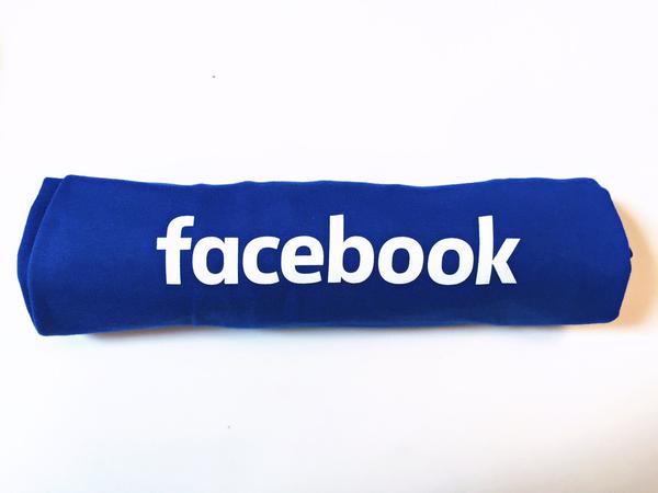
Facebook has got a new logo, but it's not completely new - just a minor tweaking with the original, so much so that you would have to look closely to spot the differences.

The new blue wordmark keeps the favicon (that's the "f" icon you see most often), changes up the "a" and features a rounder, slimmer custom typeface that's easier to read on small screens, Wired.com reported.
The point of the update was to "modernise" the logo and make it feel more friendly and approachable", creative director Josh Higgins was reported as saying by logo blog Brand New.
This latest logo refresh could easily be seen as the next step in Facebook's efforts to prune its visual identity.
"The brief for this was that it be a little more friendly and more approachable," Eric Olson, who created Klavika and the custom typeface featured in the new mark was quoted as saying.
As the creator of the original typeface, he says designing for accessibility was a matter of paring down the letters. "The thing that I really wanted to bring over to the new one was a single story 'a'. I felt like there was a point of entry there to streamline a bit," he added.
SEE ALSO: Just feel emotions and I'll know it: Mark Zuckerberg
That change to one letter makes the entire logo friendlier by conveying a sense of conviviality. In other words, the logo is simpler. Facebook started considering a new wordmark in 2013, eight years after Joe Kral and Cuban Council created the first one with a typeface called Klavika, from Process Type Foundry.
The original logo squared off letters and had thicker strokes. It was designed for a desktop world, but looked dated in our mobile-first world. "Facebook 10 years ago is very different from Facebook now.
SEE ALSO: Facebook targets 2G data users with lighter mobile app
Now it owns a fair number of things, so is more of an umbrella at this point rather than an in-the-front logo," Olson said. Facebook's in-house designers have been tucking at the brand's identity for a while now to make sure it stays consistent across all of the company's sub-products.
In 2012 and 2013 in particular, designer Ben Barry imposed a set of guidelines onto Facebook's visual identity to make sure the same favicon could work across many products and devices.
Source: IANS


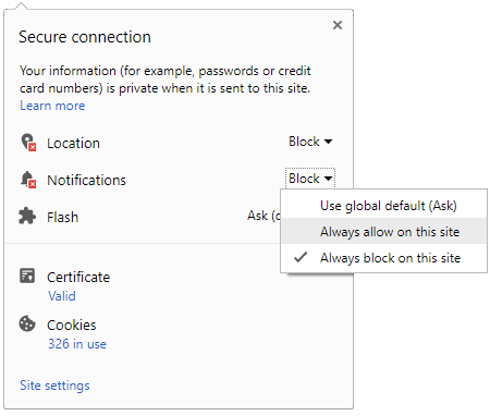
 Click it and Unblock the Notifications


-1763362932432.svg)