
 Click it and Unblock the Notifications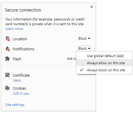
Microsoft Windows 8 logo unveiled


Experts believe that the Microsoft Windows 8 is going to be one of it's kind in the digital world. The Windows 8 logo design has a mixture of both classical as well as modern elements & thereby is attractive to look at. Microsoft has also given the “way-finding design” feel to the Windows 8 logo.
In earlier versions of the Windows operating system, the logos were in the form of flags, but now the structure of the Windows 8 logo has undergone a major change thus giving it a better feel. Microsoft has also given a flat look to the logo which makes it represent the live tiles. The exterior designing is also done using solid colors which gives a bold look.
But is the Windows 8 really worth of all this per-launch hoopla?. Only time will tell.
Comments
Best Mobiles in India
-
 1,29,999
 -
 22,999
 -
 64,999
 -
 99,999
 -
 29,999
 -
 39,999
 -
-
 63,999
 -
 1,56,900
 -
 96,949

-
 1,39,900
 -
 1,29,900
 -
 79,900
 -
 65,900
 -
 12,999
 -
96,949
-
 16,499
 -
 38,999
 -
 30,700
 -
 49,999
-
 19,999
 -
 17,970
 -
 21,999
 -
 13,474
 -
 18,999
 -
 22,999
 -
 19,999
 -
 17,999
 -
 26,999
 -
 5,999
5,999
-1763362932432.svg)

 Continue with Google