Google Chrome Canary gets redesigned Material design interface
The revamped material design UI doesn't get activated by default and a user will need to enable the experimental ‘chrome://flags/#top-chrome-md'flag by choosing the ‘Refresh' option from the drop-down
After the first developer preview of Android P was announced back in March, the users have been since then getting to see a number of revamped Material Design 2 interface. Users might have also seen code commits regarding the design of Chromium Gerrirt which was released earlier this month, however now it seems like that the tech giant is giving its user base a first look at the new design Chrome Canary for Windows

The revamped material design UI does not get activated by default and a user will need to enable the experimental 'chrome://flags/#top-chrome-md'flag by choosing the 'Refresh' option from the drop-down. A user will then need to restart Chrome Canary for the changes to be applied.
After the chrome restarts, a user will be able to notice that everything looks round and clean. This comes in line with the Google's recent shift towards the rounded UI elements, unlike the rectangular parallelograms which were available in an earlier phase.
As per some reports from the web, the Chrome browser has retained its dark grey background along with the rounded rectangular design. A user will also be able to notice that the address bar now is rounded on both the ends, which is a bit similar to the UI that we have spotted on the Google test in Chrome for Android.
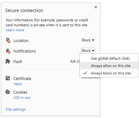
Further, the changes in the design have also trickled down into the 'Secure' certificate icon. While hovering the mouse over the 'Secure' a user can now see a pill-shaped tab. A user can click on it to see the certificate information and the permission granted to a website.

It is being further reported that the new rounded and the cleaner UI for Chrome is being appreciated by the users and this now falls in line with the other versions of the test for the browser. However, users are expecting that the tech giant should also work in the direction of making the overflow menus seem more in line with the new design, as they are at the moment sharp-edged and hardly matches with the new rounded design.

It is still not clear whether this would be the final design or not, however, it seems like Google is heading towards the correct direction with these changes. That said about the changes, we would like to hear from the users whether they appreciate these changes or not. We will also keep you posted with other tech-related news, so stay tuned with us.


 Click it and Unblock the Notifications


-1763362932432.svg)