10 Technology Logos that Changed with Time
All Technology company's are often known and identified by their logos. Several Technology company's started off with simple logos until they adopted new logos. Tech logos play an important role in the way users see them. For example, the bitten Apple in Apple's logo or the Bird in Twitter are revolutionary logos that people identify with.
SEE ALSO: How to Stop Your Automatic Updates on Windows 8.1?
Here we look at 10 technology logos that changed their logos with time. This includes both products and Technologies.
#1
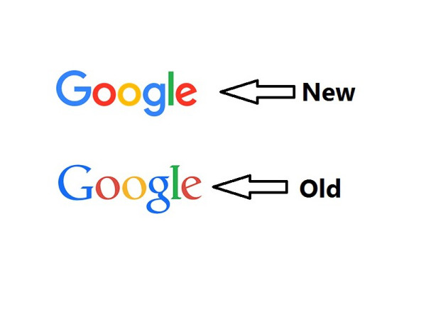
Google has changed its logo several times, (7 to be precise). However, this time the logo change was received with criticism from fans. Product Sans, Google's typeface since 2015. The Google logo appears in numerous settings to identify the search engine company.
#2
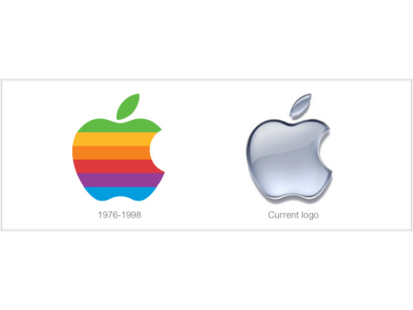
Apple has not very frequently changed its logos. The bitten apple has been its logo. However, Apple changed its logo from a rainbow colored Apple to a silver one.
#3
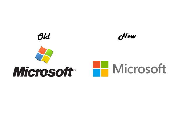
Microsoft has maintained its logo. Four Squares have been the symbol of Microsoft. However, the shape of those four squares were changed in a rebranded logo in 2014.

#4
Uber Changed its logo in Feb 2016. The new logo has the U in Uber, but it was received with very mixed reactions from Uber users.
#5
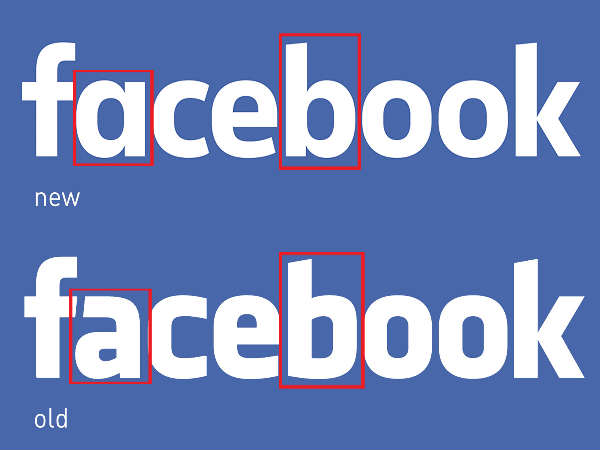
Facebook changed its logo in July 2015. The new logo hardly shows much of difference until you can spot it.
#6
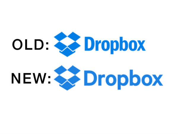
Dropbox changed it logo in Oct 2015. Again this one over here is hard to spot.
#7
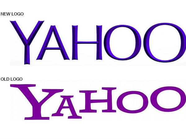
Yahoo changed its logo in September 2013. It has remained the same since then. Yahoo changed its logo only 3 times till now. Unlike some other companies who keep changing their logo.
#8
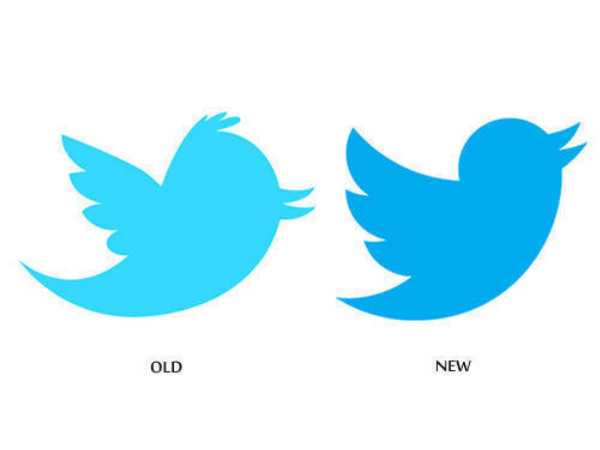
Twitter made a revolutionary change in its logo on June 2012. The bird which was the mascot of twitter has been the same since then.
#9
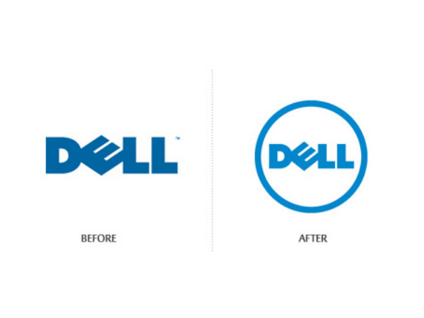
The First Dell Logo was created in 1984. However, the towards the end of 2010, the logo underwent some changes.
#10
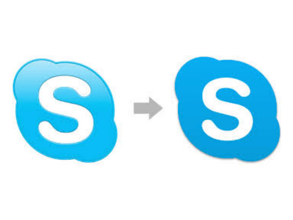
The Skype logo was changed in December 2012.The logo is pretty much the same since then.It became a single letter alphabet S from the word Skype. The single letter too underwent some change later on.


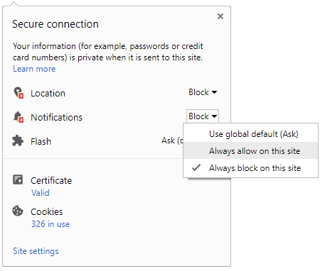
 Click it and Unblock the Notifications


-1763362932432.svg)